Increased Visibility through Colorization in ADAPT-Builder
ADAPT-Builder 2020 now includes a new Colorization option that can be...
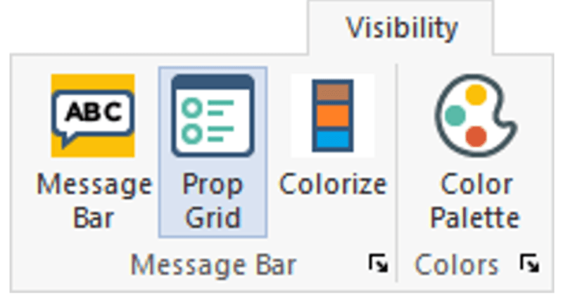
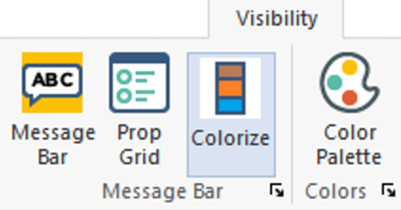
The Properties Grid is a new improvement to the user-interface for ADAPT-Builder v20. The Properties Grid is a docked window, that facilitates user efficiency when modifying a single component or a selection of components. In addition, the user can use the property grid to filter-select components. The Properties Grid is open by default but can be made active or inactive by going to Visibility > Message Bar and clicking the Prop Grid icon shown highlighted below.
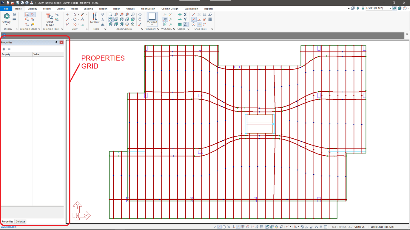
In ADAPT-Builder 2020 the new Properties Grid, by default, opens on the left side of the user interface as shown below. The user can dock this window on any side of the modeling interface or allow it to float on screen.
As the user selects components on the screen the two columns within this window pane will populate with like criteria of the component(s) you selected. If the user selects only one component all properties for that component will be available. If the user selects multiple components the list will populate with the properties that are similar between the selected components. Users can easily expand and contract the property options by use of the tools Expand All (+) icon and the Collapse All (-) icon.
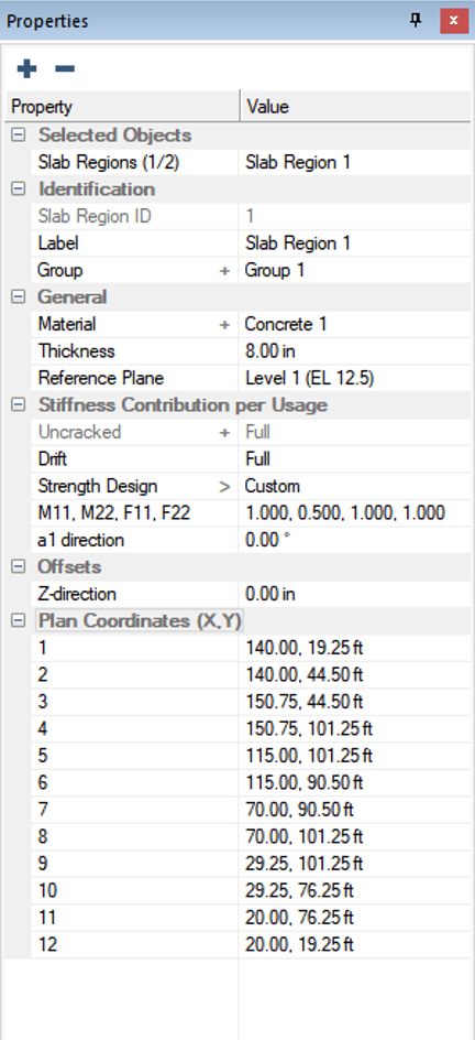
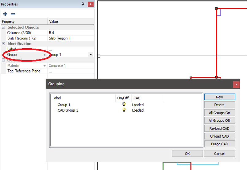
The Property column of the Properties Grid lists the properties whose values can be modified by the user through this interface. If a property that can be selected is defined by the user in another location of the software, a shortcut to the window where the property is defined is provided within the Property column of the Properties Grid.
Another useful option that can be found in the Property column of the Properties Grid is the ability to filter-select components. The user can right-click on a selected component type in the Selected Option category to get a list of right-click options.
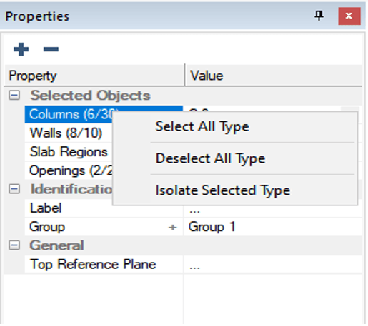
The user can Select All Type, Deselect All Type, and Isolate Selected Type. The Select All Type option will select all the given type of the components visible on screen. The Deselect All Type option will remove the given type of components from the current selection set. The Isolate Selected Type option will remove all other components not in the given type from the selection set.
The Value column displays the value assigned to the property. The component is updated dynamically when the property is modified by the user. The user can also define the properties of a component they are modeling in this pane during the modeling procedure.
If the user has selected multiple components with a similar property, the Value column allow the user to modify like properties for the group of selected components.
The Description Pane is located at the bottom of the Properties Grid window. When a user clicks on a property in either the Property or Value column the program will display, in the Description Pane, a detailed description of the selected property.
To learn more about the Property grid, view the video below:
ADAPT-Builder 2020 now includes a new Colorization option that can be...

The latest release of ADAPT-Builder 2019 includes improvements that...

RISA is excited to announce the acquisition of ADAPT Corporation....